Nelsons
Rebranding a top 200 law firm
There’s something about humble beginnings that gives you a solid grounding. Nelsons started out in a small office above a shop in Nottingham. Today they are recognised as a top 200 law firm having gown organically and via mergers & acquisitions.
So how can a rebrand make a genuine contribution to a firm which is already well established? If you can capture the essence of a brand, find out what really makes it tick and then amplify it with creativity - then every £ spent on marketing will have a much better payback. Witness the 9 major industry awards won already since the new brand identity was launched.
An in depth review of the brand sought opinions from partners, staff, referrers, clients, potential clients and media.
To ‘capture the essence of a brand’ is easy to say but so much harder to do. That’s because it takes time and effort to do it right. But it’s the right way to start off a branding project - otherwise it’s just cosmetic.
Professor Damian Hughes was instrumental in helping to shape the thinking of the partners. He works across academia, high performance sport & psychology - combining his knowledge to help organisations create high performance culture. And for our part when we’re getting under the skin of a brand this is an ideal starting place.
For most businesses What they do is reasonably easy to define. How they do it (or values) is harder to define. And Why they do it really does take some soul searching.
Pushing boundaries to empower
This is Nelsons Why. Or put another way, their purpose, cause or passion.
“Empower - make someone stronger and more confident - especially in controlling their life and claiming their rights”
For the new thinking to deliver value it needed to run through the business from top to bottom. So it’s much broader than the design and language of the marketing communications.
If Nelsons were a stick of rock then wherever we break it we should recognise the core values running through the middle. These values should be guiding principles for staff and partner behaviour.
Why is this important?
Because everyone has to live up to the promise. If Nelsons don’t live up to their promise - any comms based on the new thinking will just emphasise the gap between what you promise and what you actually deliver. So you’d be paying for comms which would deliver a negative impact.
But it’s not enough in isolation
The point is - that new thinking isn’t a panacea. For most organisations it just remains as a document or a page on a website. BUT - if you’ve involved everybody in developing your thinking and you start to live and breathe it - then it can become a very powerful positive force.
Embedding behaviours
Some organisations drive their values through the business by using them as part of the appraisal. Rate measurable commercial performance and rate behaviour which supports the values.
Good on values + poor on performance = training needed
Poor on values + good performance = change your ways or bye bye
Many very successful global companies have adopted this approach. On one level it seems to contradict - after all why would you let someone go who was delivering good financial performance.
On the other hand - you’ve established your thinking and values to create the necessary balance between the requirements of clients, staff, partners and community. If staff openly ignore the values then word travels fast and the whole vision starts to erode from the inside.
A creative and flexible brand identity system helps to embed the values internally on an ongoing basis. That’s in addition to projecting the right messages to the outside world in a compelling way.
In the wider research, approachable expertise came through as a strong thread. We could also see that most law firms tend to use far too many words in their comms and the whole sector is drowning in a sea of navy blue. Say hello to pantone 1645…
Most professional firms would fear such a bold change in their brand identity but because we were all on board with the thinking from the start it struck the right chord. Initially a little unsettling but then if it wasn’t, we probably hadn’t pushed the envelope far enough.
To summarise the process…
Thinking - Research - Define Culture - Bring to life via Design - Embed Internally - Amplify Externally
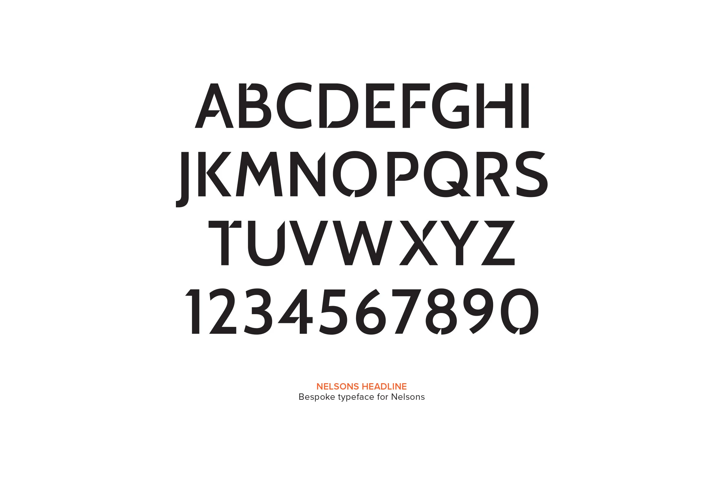
One element of the new design was a bespoke headline font which starts to give instant recognition of Nelsons. It’s designed to be used for single word and short headlines and at large scale - to give maximum impact.
The applications of the new brand identity were many and varied across the 3 city centre offices and beyond. Interiors, signage adverts, printed materials, web and social all needed addressing. Mergers & acquisitions have also been integrated into the new brand since launch.
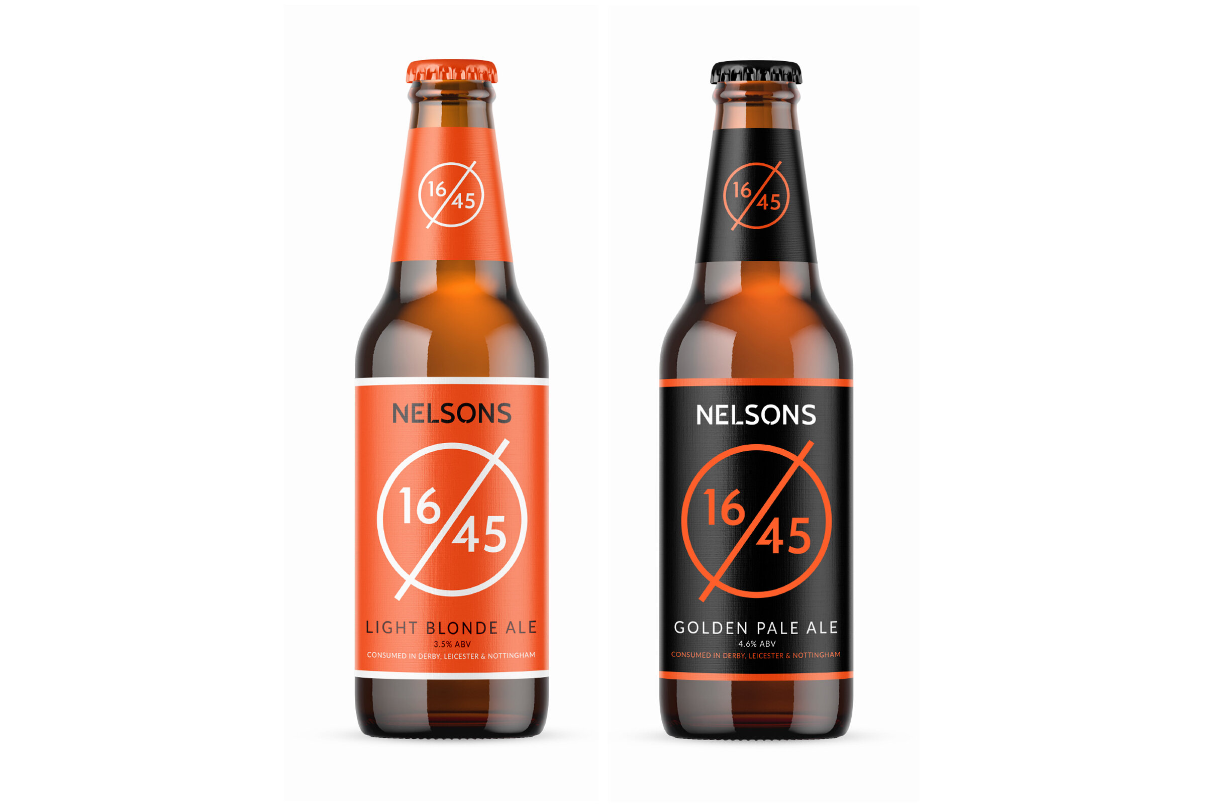
And not forgetting the beer packaging…

Along with the visual element we also defined tone of voice for the Nelsons brand. Tone of voice is the style of writing. Just as the visual identity needs to capture the spirit of Nelsons, so does the written word. Take any 500 words of text. If you can put the same message across in a more compelling, simpler way - using just 250 words, then there’s strong argument to say that would be twice as effective. Imagine that effect over your entire written communications - continually.
The Nelsons brand guidelines capture all this and more giving a strong foundation from which to push forward.
Branding
Interior Design
Website Design


