MUU MUU
Whatever you do, don’t mention the M word
This project was a new start up - the idea being to confront the menopause head on and stop it from being such a taboo subject.
So we started with a blank canvas - first defining the brand, a crucial stage before moving on to the name. Muu Muu has Hawaiian origins - a woman’s loose brightly coloured dress. So a sense of the care free, optimistic, vibrant. Feminine without being overtly so.
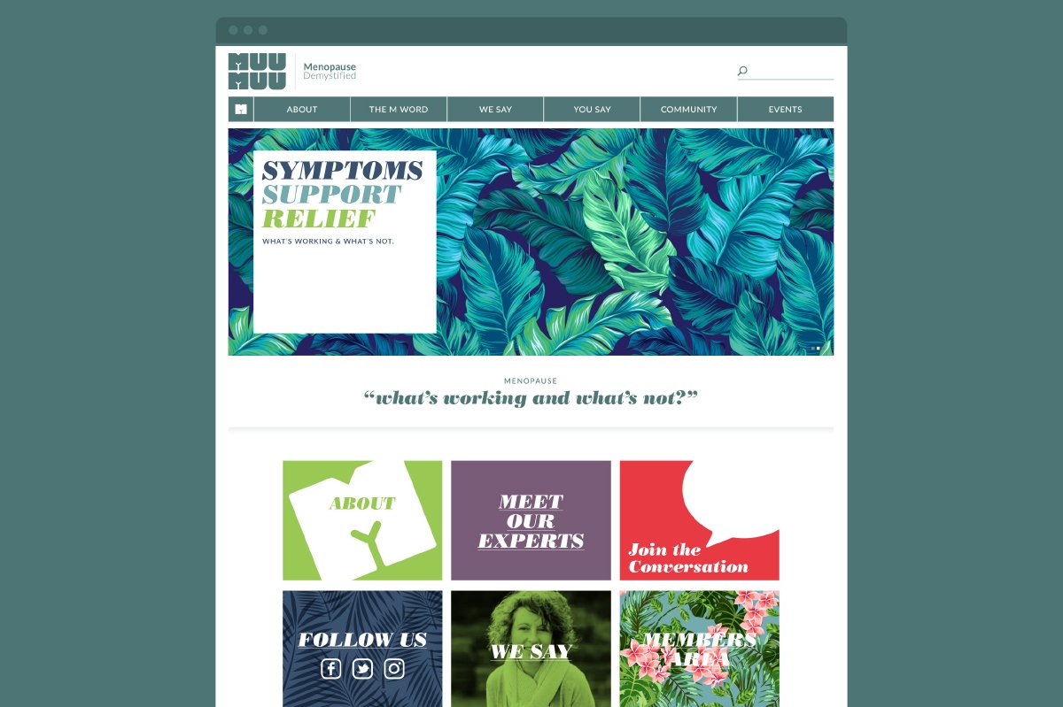
Strong, bold, confident typography is at the heart of the logo. It always appears in a stacked block form making it easier to read and easier to pronounce. This compact shape and badge like quality lends itself to digital applications where space is at a premium. And there’s the twist of subtle humour created by the negative space in the M’s.
We wanted the identity to enable us to vary the tone easily and one of the ways we do that is via the use of Hawaiian inspired patterns. Four designs have been chosen of varying complexity to be used both on-line and in print formats. The website offers a variety of ways to engage. Sharing experiences, listening, learning - and laughing….
This fledgling brand has been captured in a mini set of brand guidelines, covering; brand definition, logo, colours , images, fonts and finished examples.
Branding
Website


